Design journey
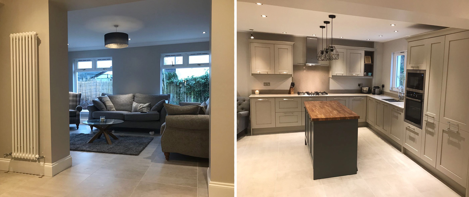
The client wanted a traditional looking kitchen, with a few modern twists. They wanted a space big enough for a growing family and big enough to cook and dine in, but also one they were still able to entertain guests in. Our challenge was to prove a timeless look but one that would still feel current.
In order to fit in all of the client’s requirements there was a lot of construction work to do first. The ground floor originally consisted of a kitchen/dining area, a utility room and a dining room, which led to the sitting room.
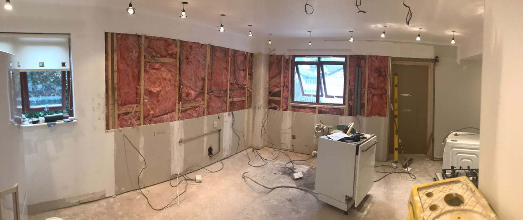
To adapt the area to the client’s brief we removed the stud walls, one of which was a structural wall. This meant we had to prop up the first floor by installing two structural beams. Once this was finished it left an amazing space, an open plan kitchen/dining and living area.

We worked closely with the client during the whole design process in order to stick to their brief. The brief was a practical kitchen with plenty of storage and the element they most wanted was an island. It’s also important to offer continuity in a room when it comes to choosing things like the colour, style and materials used.
Below is the design we worked on with the client.
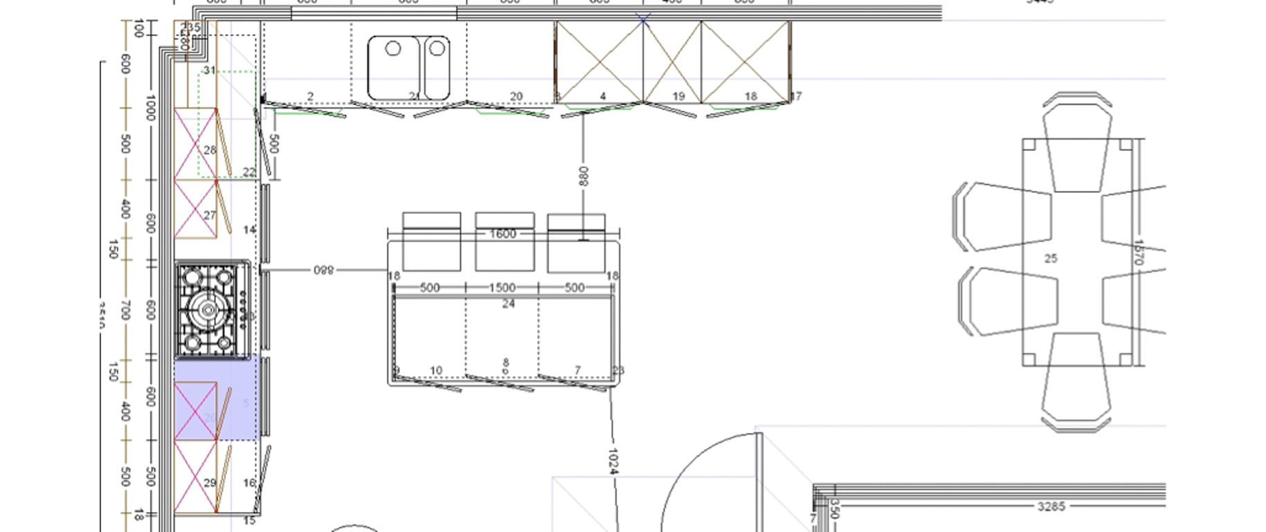
Like any design we work on, we work within the constraints of the room and work out where to fit in the essentials i.e. your oven, hob, dishwasher, washing machine.
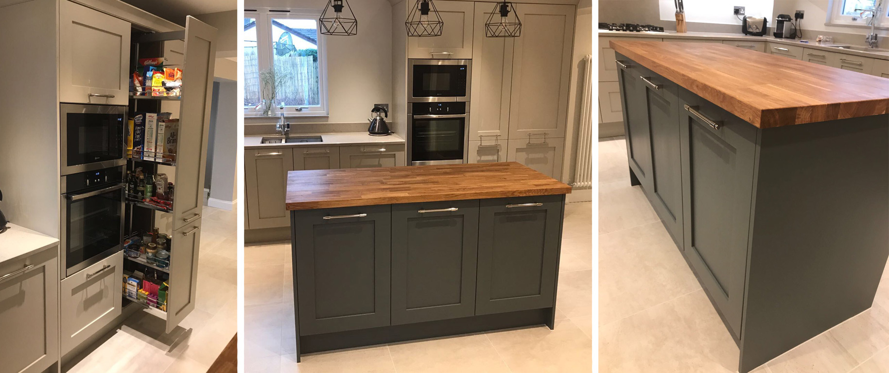
The appliances installed are integrated to the furniture and are from Neff [see more kitchens with Neff appliances]. The oven has a neat slide and hide door (as seen on the Great British Bake Off), which makes an impressive feature and also saves on space around the cooking area.
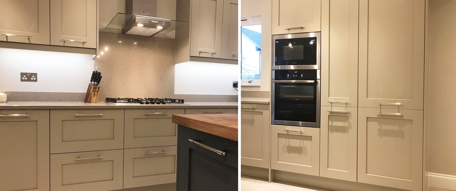
We also ensured there was plenty of storage available with deep pan drawers, additional wall cabinets and a pull-out Larder.
Another aspect of the design stage is the lighting. Our state-of-the-art ArtiCAD software offers us the option to add lighting anywhere in the room and shows the throw of the light through the 3D Panoramic Viewer. This gives us the opportunity to see if there’s enough lighting in the room, or even too little, before we start the installation stage [read more about our customer journey]. This prevents unnecessary work, like cutting holes in finished ceilings to move lights, due to insufficient lighting.
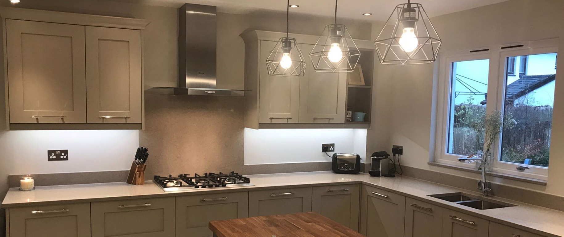
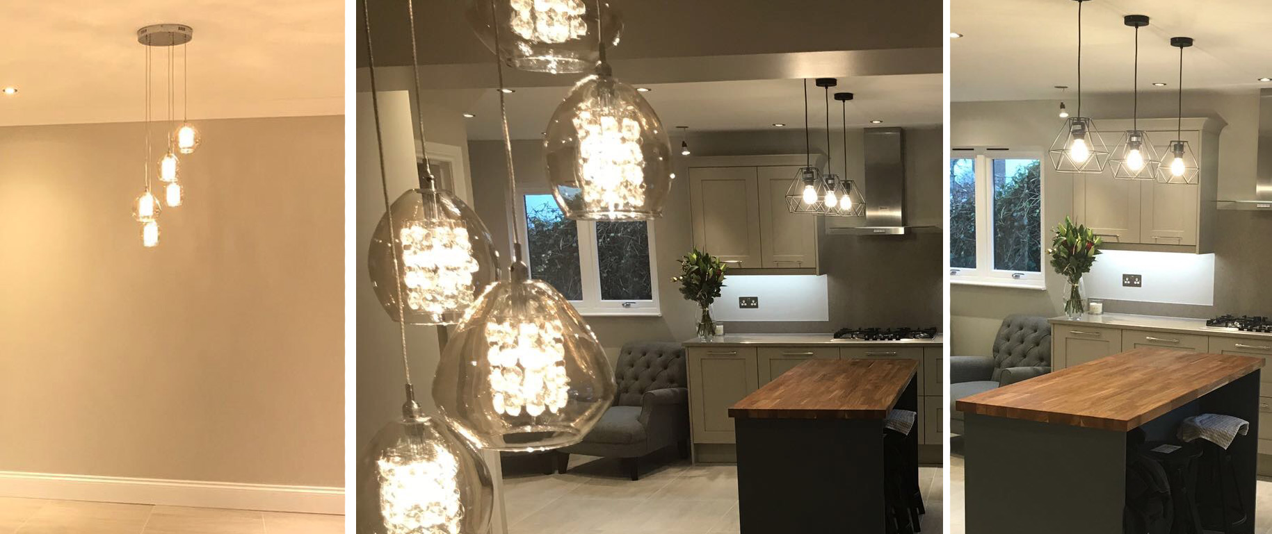
Our client opted to install a feature pendant light above the island and also above the dining table. Elsewhere in the kitchen down lights were installed to enhance the space. Under cabinet lights were also installed to light up any dark spots created by the wall units.
Another great feature was the under floor heating which was installed throughout the entire space. Due to the size of the room and the tiles used it’s possible that the room wouldn’t be as warm as other spaces. The under floor heating takes the cold-feeling out of the tiled floor and we also installed traditional-look column radiators which all do a great job of heating the open space. They also add to the traditional feel of the whole room.
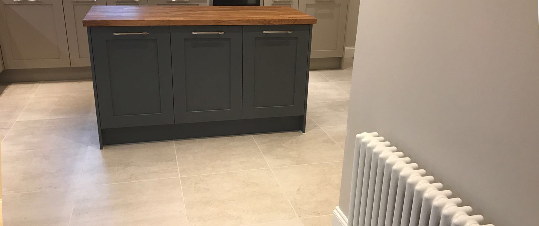
The kitchen range used in the room was Woodland in a shaker-style design. The door colours come in Stone and the island came in a slate grey. The impressive worktop on the island is made from solid oak and the worktops on the main units are elegant clay quartz.
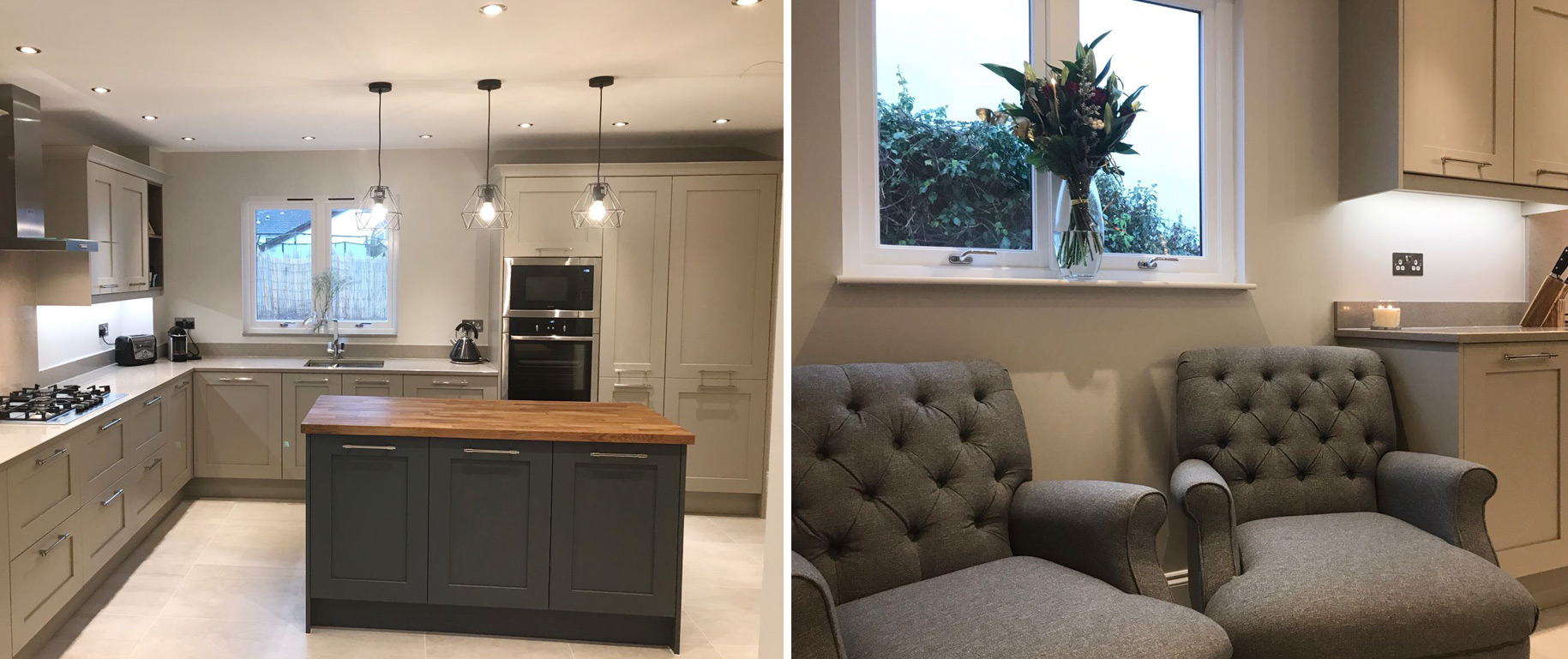
The floor tiles were from one of our main suppliers, Porcelanosa, and come in the colour Rodano Caliza. Both the wall paint and the wall paper were from the Farrow and Ball range.
You could have this amazing kitchen too. Drop us a message on Facebook, email us at sales@dbrinteriors.com or call us on 0141 771 2275.
