Before and After - Baillieston Kitchen
At DBR Interiors we’re always keen to deliver a bathroom or kitchen to the exact specifications of our clients. Our Before & After feature will show you the work that’s put into every project.

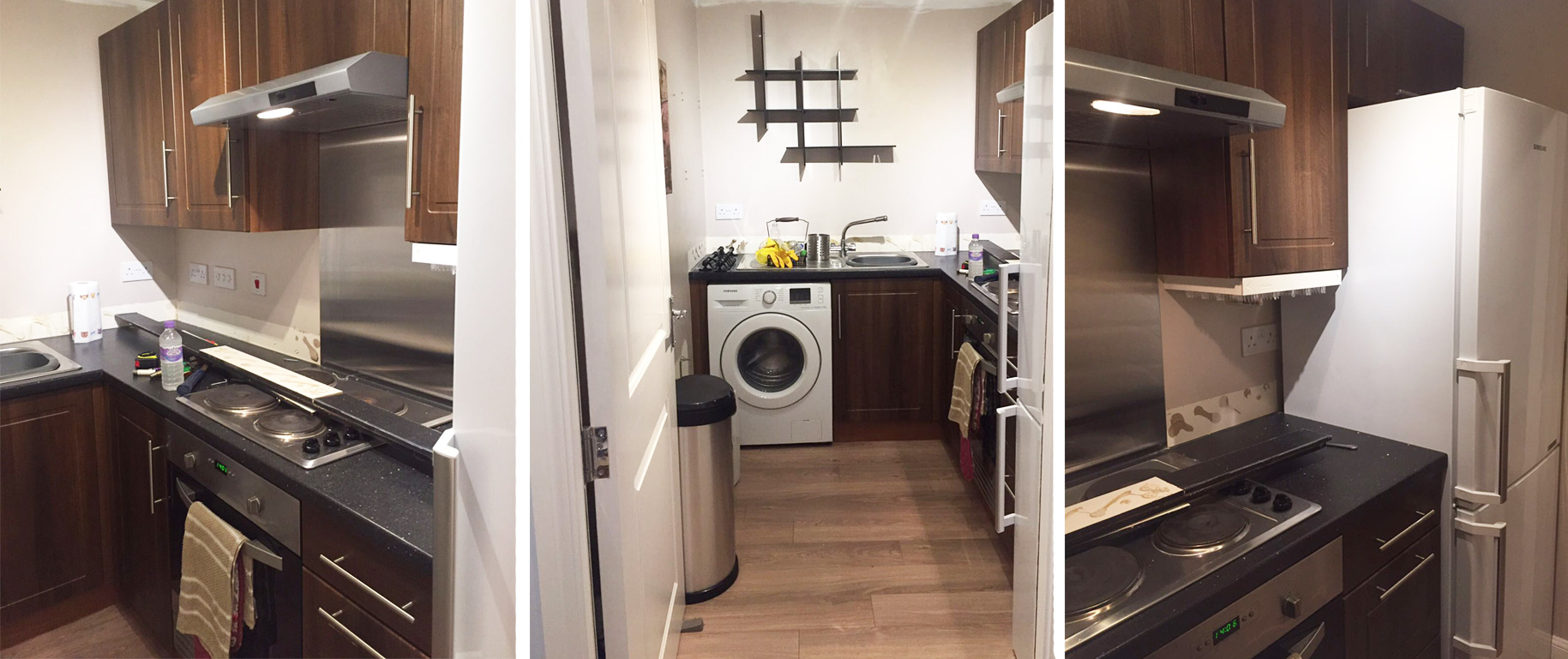
The aim for this project was to make the kitchen feel bigger than it actually was. The ‘before’ kitchen had wall-to-wall mounted units with an integrated cooker hood. These units were dark in colour which made the room feel smaller, especially as there’s no natural light.

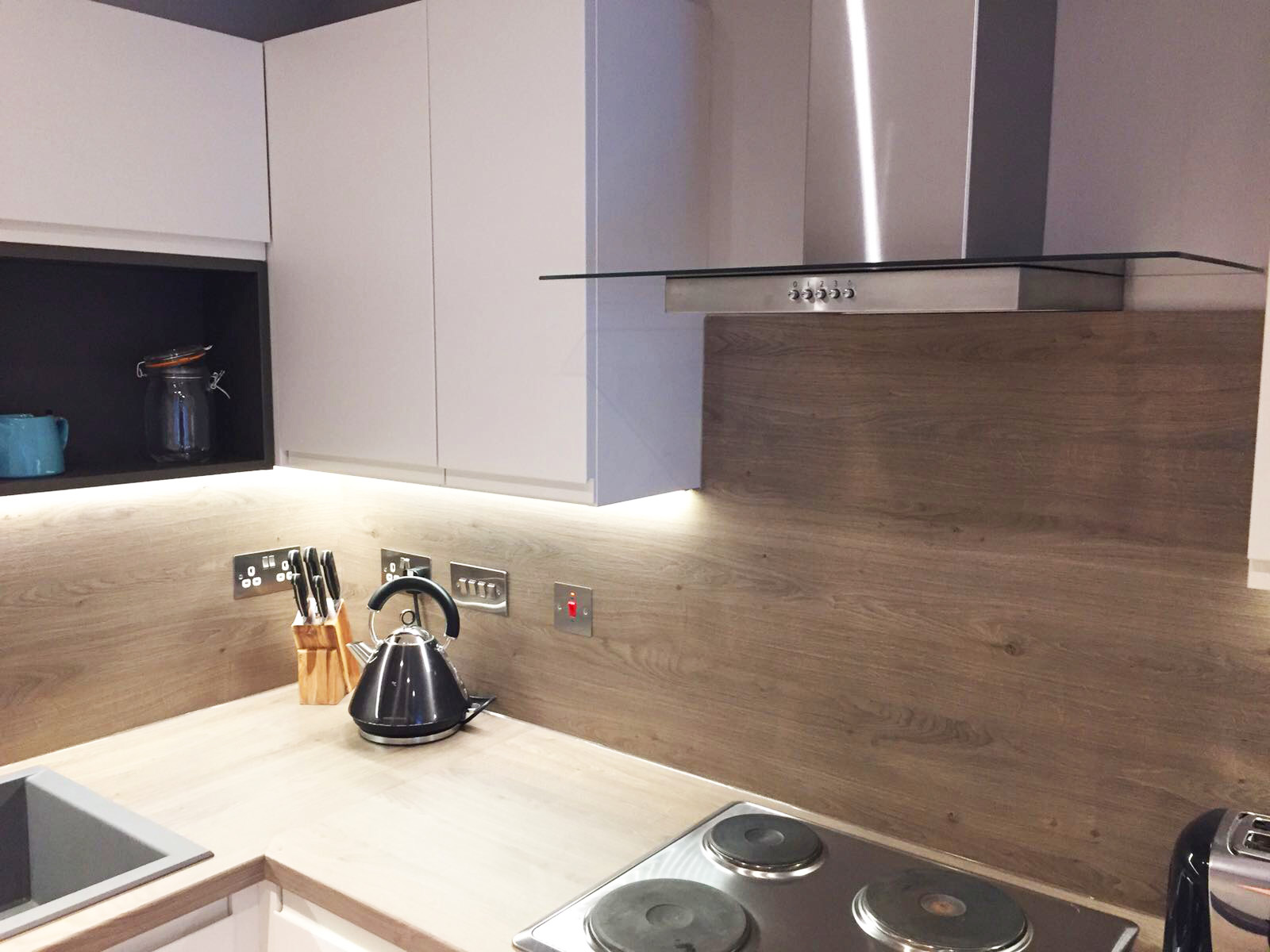
One of the first things we did to improve on the space in the room was removing the built-in extractor fan. In the original kitchen the cabinets were fitted right to the edge of the existing fan, so the space felt closed in. The new units were made 100mm smaller than the originals and we installed a contemporary chimney style hood to make that particular wall look wider.
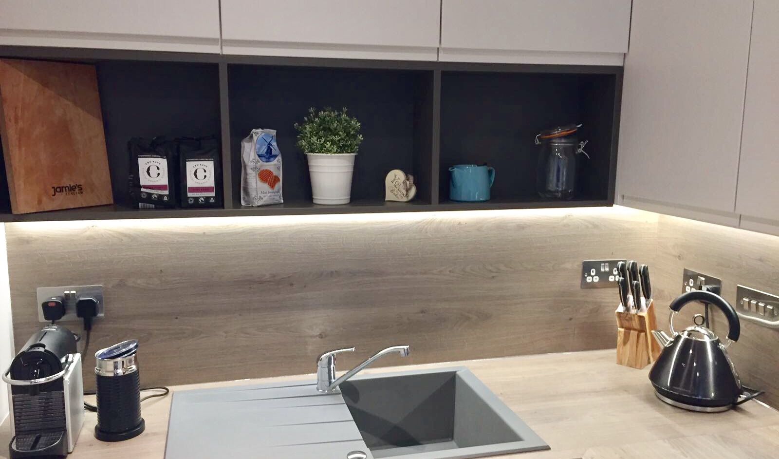
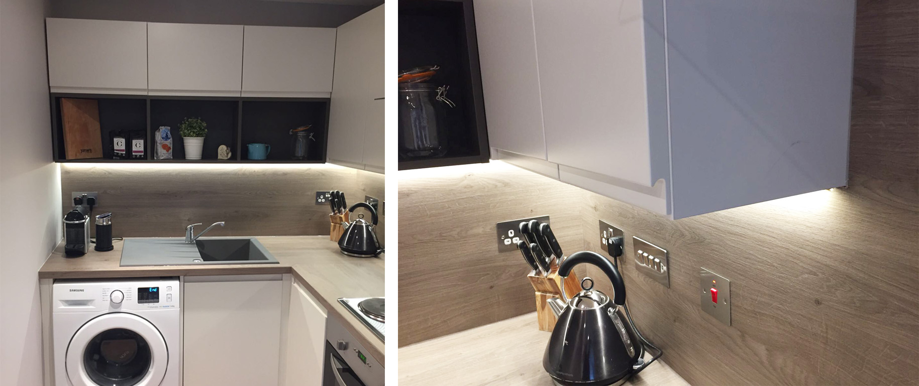
The client chose to go with cabinets from the Busby range. The doors in this range are handless which makes them look slicker and meant no handles encroached the small kitchen. To make the room look modern we installed a combination of closed and open cabinets. The doors are matt porcelain and the open cabinets are graphite grey. The open cabinets are a great feature and an alternative way of displaying kitchen appliances and utensils, without cluttering the worktops. The light, neutral colours chosen helped make the room look bigger and brighter.

The splash backs were fitted all around the length of the cabinets and this matched the worktops, smooth and modern. These were illuminated by the under cabinet LED lighting. The granite grey sink was another striking addition to this kitchen.

For more hints and tips on how you can increase space in your own home then check out our blog - 5 ways to make the best use of a small space.